
Heartbeat of Twitter (map)
What Twitter Really Looks Like – about Tweetping, a visualization of Twitter activity in real time.
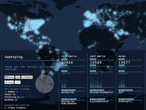
Tweetping is a visual reminder of the distribution of Twitter, the flow of it, the scale of it. It tracks straight-from-the-API info like total tweets (and words, and characters) per second, as well as latest hashtags and latest @-mentions — all of those broken down by global geographic area. The map reveals Twitter’s digital movements through the physical world via stark explosions of light — but it reveals just as much through its stagnant swaths of darkness.
Saw it on the ever-interesting ResearchBuzz.